Script one canonical CTA, place it by video length, and reuse the exact wording across voice, on-screen text, and buttons. Includes a five step checklist,...

Five Step Video CTA Checklist for Production Teams: Examples & Timing
Ask for one clear action, say it in five to eight words, and place it early enough for viewers to act on it. Under one minute, put the call to action in the first quarter of the video. Between one and three minutes, use mid-roll placement. Between three and five minutes, place it around the halfway mark. Repeat the same line in voice and on screen so nobody misses it.
TL;DR:
Placing a call to action early, such as in the first quarter for videos under one minute, is crucial for maximizing viewer engagement.
Combining verbal and on-screen text CTAs significantly increases click-through rates, especially when tailored to muted or silent viewers.
Use consistent wording across voiceover, graphics, and buttons to prevent viewer hesitation and improve conversion performance.
Testing one variable at a time, such as copy or placement, helps identify the most effective CTA without confusing the audience.
Adjust CTA placement based on video length, platform attention span, and device visibility, with shorter videos requiring earlier asks.
Table of Contents
What Is a Call to Action in Video, and Why Does It Matter?
What Types of Video CTAs Should You Use?
When Should You Place a CTA in Your Video?
How Do You Write a Video CTA That Actually Converts?
Do Different Platforms Need Different CTAs?
How Do You Measure and Improve Video CTA Performance?
How Does a Production Team Script and Deploy One CTA Across a Whole Video?
Five Video CTA Examples Worth Copying
Key Takeaways: Your Five-Step CTA Checklist
Why Examples and Timing Beat Every Other CTA Framework
Sources
FAQ
What Is a Call to Action in Video, and Why Does It Matter?
A call to action in video is the specific instruction you give a viewer, spoken, shown on screen, or both, that tells them exactly what to do next. It’s the line that turns a viewer into a lead, a donor, or a customer.
Every strong video CTA follows a psychological sequence. First it grabs attention. Then it builds an emotional connection. Then it gives the viewer a logical reason to act. The CTA should close that loop, not interrupt it, according to research on the psychology behind high-converting video.

Get the sequence right and the numbers back it up. Video CTAs convert at an average of 16% across digital channels, and well-placed CTAs that match viewer intent and video length can push conversion rates as high as 40%.
What Types of Video CTAs Should You Use?
A video CTA can be verbal, written on screen, built into an end screen, layered as a clickable overlay, or fully interactive. Most high-performing videos use two or three of these together, not just one.
Here’s how each type works and where it fits best:
Verbal CTA: The host or narrator says the ask out loud. Works in every video but fails silent autoplay viewers unless paired with text.
On-screen text CTA: A caption or lower-third graphic states the ask. Essential for social feeds, where most viewers watch muted.
End screen CTA: A clickable card or graphic at the video’s close. Works well on YouTube, where end screens link directly to another video, playlist, or website.
Overlay CTA: A button or banner that appears mid-video without stopping playback. Useful on landing pages and product demos.
Interactive CTA: Clickable hotspots, quiz branches, or shoppable tags. Best for e-commerce and long-form training content.
Silent viewers are the reason layering matters. If your CTA only lives in the voiceover, you lose every viewer scrolling with the sound off. Case studies show that combining verbal and visual CTAs, rather than relying on one alone, produces click increases of several hundred percent over sidebar-only placement.
Pro Tip: Write your CTA once, then paste that exact wording into your script, your on-screen graphic, and your button copy. Three different versions of the same idea reads as three different offers to a viewer’s brain.
When Should You Place a CTA in Your Video?
Placement depends on video length, and the rule is simple enough to memorize before your next shoot. Shorter videos need the ask fast. Longer videos can wait until you’ve built enough emotional payoff to justify it.
The timing benchmarks from Wistia’s guidance on video CTAs break down like this:
Video length | Recommended CTA placement |
|---|---|
Under 1 minute | First quarter of the video |
1 to 3 minutes | Mid-roll |
3 to 5 minutes | Around the halfway mark |
Three context factors change these rules on the ground:
Platform attention span: TikTok and Reels viewers decide to scroll within seconds, so even a 90-second video may need its CTA earlier than the mid-roll rule suggests.
Landing page placement: A lightbox modal that pops the video over the page keeps the CTA visible after playback ends. Case testing from Unbounce and Vidyard showed a lightbox lifted conversion from 6.5% to 13%, roughly double the inline embed.
Mobile visibility: A hero video with a giant CTA button often gets pushed below the fold on phones. Shrink the hero size, keep the button in the visible frame, and test lightbox over autoplay background video.
How Do You Write a Video CTA That Actually Converts?
Write your CTA in five to eight words, lead with a strong action verb, and name the exact benefit the viewer gets for clicking. Anything longer forces the viewer to read instead of act, and anything vague gives them a reason to scroll past.
Three rules make the difference between a CTA that gets ignored and one that gets clicked:
Keep it to one ask. “Subscribe and download the guide” splits attention. Pick one action per video.
Pair the verb with a benefit. “Learn more” tells a viewer nothing. “Download the free checklist” tells them exactly what they get.
Match urgency to funnel stage. A cold audience needs a low-friction ask. A warm audience close to a decision can handle a bigger commitment.
Here are templates by funnel stage:
Awareness stage: “Subscribe for weekly tips” or “Follow for more stories like this.”
Consideration stage: “Download the free guide” or “Get the checklist now.”
Decision stage: “Book your free demo” or “Start your trial today.”
Short, benefit-driven phrasing outperforms generic phrasing when the ask requires even a small action from the viewer, according to reporting on video psychology and conversion behavior. “Download the guide” beats “Learn more” nearly every time it’s tested head to head.
The line matters less than the consistency behind it. Whatever you write, make sure the spoken line, the on-screen graphic, and the button text are identical. A viewer who hears one phrase and reads another hesitates, and hesitation kills clicks.
Do Different Platforms Need Different CTAs?
Yes. Each platform gives you different native tools, and using the wrong tool for the platform wastes the CTA entirely.
YouTube gives you cards that appear mid-video and end screens that appear after playback stops. Use a card around the two-thirds mark to seed intent, follow with a verbal CTA near the end, then close with an end screen that links directly to your website or next video. This three-step sequence builds intent before it asks for the click, a mechanic unique to YouTube’s native CTA tools.
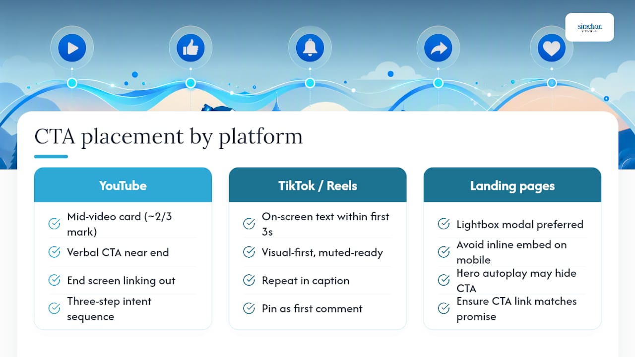
Landing pages convert best with a lightbox modal rather than an inline embed, based on the Unbounce and Vidyard testing referenced above. A hero video autoplaying in the background looks impressive but often buries the CTA button below the fold on mobile screens.
TikTok and Reels demand a visual-first approach. Viewers scroll fast and watch muted, so put the CTA in bold on-screen text within the first three seconds, then repeat it in the caption or pin it as the first comment.
Embeds and email need one final check: the link behind your CTA button has to lead exactly where the CTA promised. A mismatch between the ask and the landing page is one of the fastest ways to lose a viewer’s trust.
How Do You Measure and Improve Video CTA Performance?
Track click-through rate, conversion rate, and watch time around the CTA moment, then run one variable at a time through A/B testing until you find what moves the numbers.
Three metrics matter most:
Click-through rate (CTR): How many viewers click the CTA out of everyone who watched to that point.
Conversion rate: How many clicks turn into a completed action, a signup, a download, a booking.
Watch time around the CTA: A drop-off right before your CTA moment usually means the placement is wrong, not the copy.
Test one variable per experiment: copy, placement, modality, or creative treatment. Testing two at once tells you nothing about which change caused the result. A typical first experiment compares two CTA phrasings on the same video at the same placement, run until you’ve got enough traffic to trust the winner, usually a few hundred clicks per variant.
Personalized CTAs placed inside the video itself tend to outperform generic ones tucked in a sidebar, and testing this alone often finds meaningful gains fast, based on findings from Lunabloom AI’s 2026 CTA guidance. Declare a winner once one version pulls ahead consistently across a full week of traffic, not after a single strong day.

How Does a Production Team Script and Deploy One CTA Across a Whole Video?
Simchon Productions writes the CTA once, then repeats that exact line across every touchpoint: voiceover, on-screen graphic, button copy, and video description. This single-line discipline is what keeps a viewer from getting three slightly different messages instead of one clear ask.
On set, legibility rules protect that message. Text has to stay large enough to read on a phone screen, held inside safe zones so nothing gets cropped on vertical formats, and set against enough contrast that it doesn’t disappear over busy footage.
Distribution has its own checklist:
Captions burned in or uploaded, so muted viewers still get the CTA.
The same line pinned as the top comment or written into the description.
End screens set up before export, not added as an afterthought.
The landing page destination checked against the CTA’s exact promise.
Pro Tip: Before final export, read your CTA line out loud, then read the on-screen graphic, then read the button copy. If you notice yourself changing even one word between the three, fix it before you publish.
Five Video CTA Examples Worth Copying
Here are five CTAs mapped to modality, timing, and funnel stage, ready to test on your next project.
“Subscribe for weekly stories” (verbal + end screen, top-of-funnel). Works because it asks for a low-friction habit, not a purchase. Test it against “Follow for more like this.”
“Download the free guide now” (on-screen text + button, mid-funnel). Names a concrete deliverable instead of a vague action. Test “guide” against “checklist” to see which word pulls harder.
“Book your free consultation” (verbal mid-roll, decision stage). Removes cost as a barrier by naming “free” up front. Test placing this at the two-thirds mark versus the true midpoint.
“Tap to see the full story” (overlay, social feed, top-of-funnel). Built for muted, fast-scrolling viewers. Test a static overlay against an animated one.
“Start your trial today” (button + verbal, bottom-of-funnel). Short, direct, and time-bound without an artificial deadline. Test “today” against “free” as the urgency word.
Key Takeaways: Your Five-Step CTA Checklist
The single most important rule is this: one clear action, said in five to eight words, placed early enough to match your video’s length.
Before your next project, run through this checklist:
Script one canonical CTA line before you shoot, not after you edit.
Choose your modality mix: verbal, on-screen text, or both.
Set placement by length: first quarter under one minute, mid-roll for one to three minutes, halfway for three to five minutes.
Test one variable, usually copy, before touching placement or modality.
Measure CTR and conversion rate weekly, not just on launch day.
Start with a copy A/B test. It’s the fastest way to see what your audience actually responds to.
Why Examples and Timing Beat Every Other CTA Framework
Most CTA advice treats placement like an afterthought, something you slap on at the end of the edit once the story is locked. That’s backwards. The placement decision should happen in the script phase, before a single frame gets shot, because a CTA dropped into the wrong spot in post-production is a CTA fighting the emotional arc instead of resolving it.
The conventional wisdom oversells copywriting and undersells consistency. Marketers spend hours workshopping the perfect five words, then let the voiceover say one thing, the graphic say another, and the button say a third. That mismatch costs more clicks than a mediocre verb choice ever will.
What I’d prioritize first, if I could only fix one thing on a client’s video: write the CTA line once, in the script, before the shoot. Everything else, the on-screen graphic, the button, the description, should copy from that single line word for word. Timing by video length matters, and the benchmarks are worth following. But timing without consistency is a well-placed CTA that still confuses the viewer at the moment that matters most.
If your team needs help building that discipline into a shoot from the ground up, the production portfolio at Simchon Productions shows how a scripted CTA carries through from voiceover to final export. You can also see how Simchon Productions approaches brand films, nonprofit videos, and event films for organizations across the New Jersey and New York City area.
— Tzvi Simchon
Sources
FAQ
What Is an Example of a Call to Action in Video?
A common example is “Download the free guide now,” shown as on-screen text and spoken by the narrator at the same time, then repeated as the button label. Another is “Subscribe for weekly stories,” used at the end of a YouTube video paired with an end screen card.
What Is a CTA in Video Editing?
A CTA in video editing is the graphic, text overlay, or end screen element an editor builds into the final cut to prompt viewer action. Editors place these based on the video’s length and pacing, following rules like mid-roll placement for one to three minute videos.
What Are Some Strong Call to Action Phrases?
Strong phrases pair an action verb with a clear benefit, such as “Download the free guide,” “Book your free demo,” “Start your trial today,” “Subscribe for weekly tips,” and “Get the checklist now.” Each works because it names the exact next step in five to eight words.
What Is a CTA in Film?
In film and video production, a CTA is the specific instruction placed in the script, on screen, or in an end card that asks the viewer to take an action after watching. It typically appears once early to seed intent and once more near the video’s close to close the loop.
How Long Should a Video CTA Be?
A video CTA should run five to eight words, long enough to state one clear action and its benefit, short enough to read or hear in a few seconds without slowing the video’s pace.